
Nashville, TN Wholesale Florist | Saying It With Flowers Since 1868

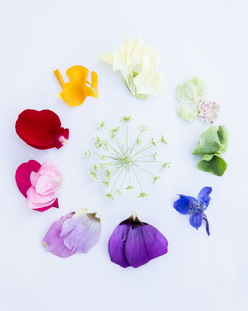
PANTONE? Every year, since 2000, Pantone releases their color of

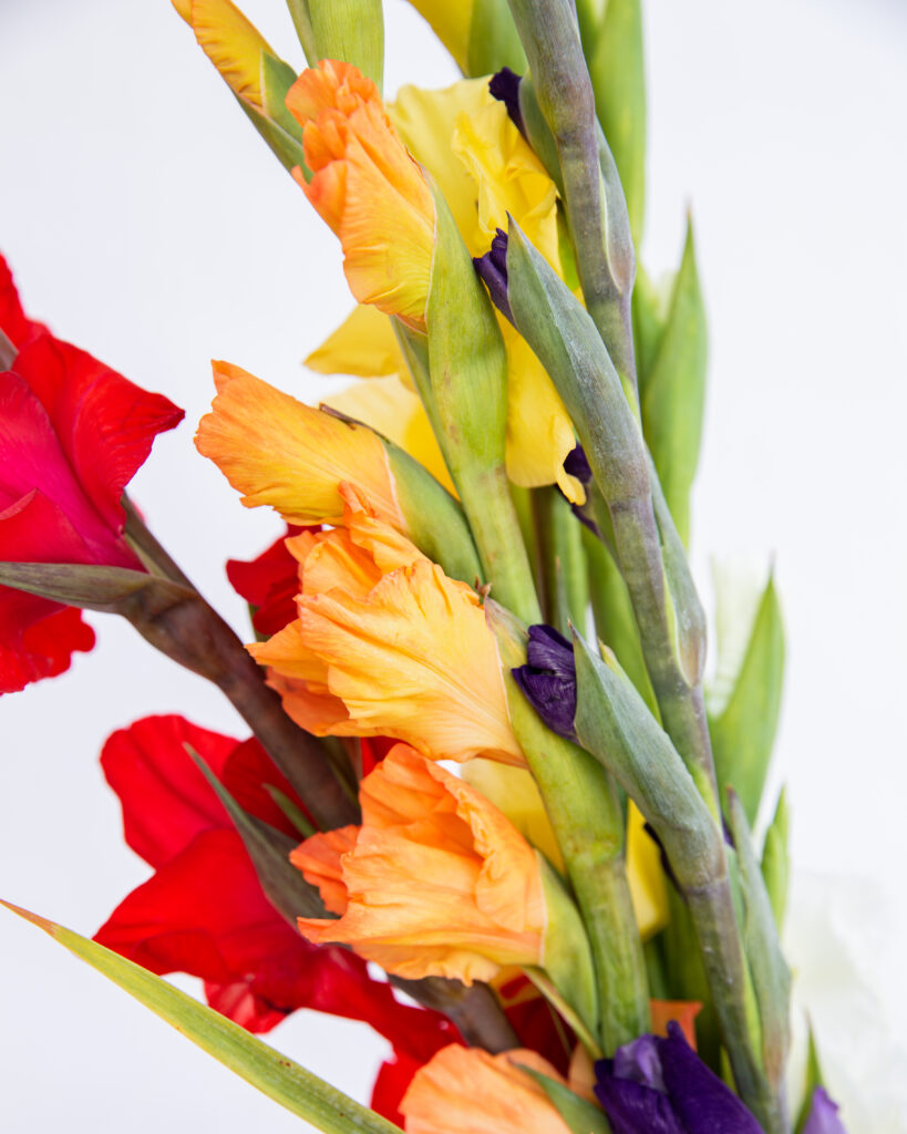
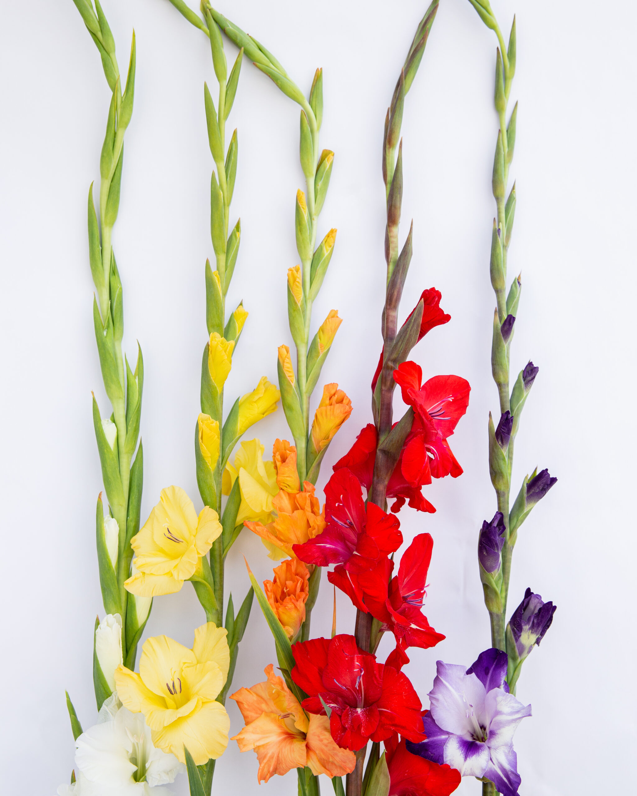
WHAT’S THE DEAL? In the world of flowers, a lot

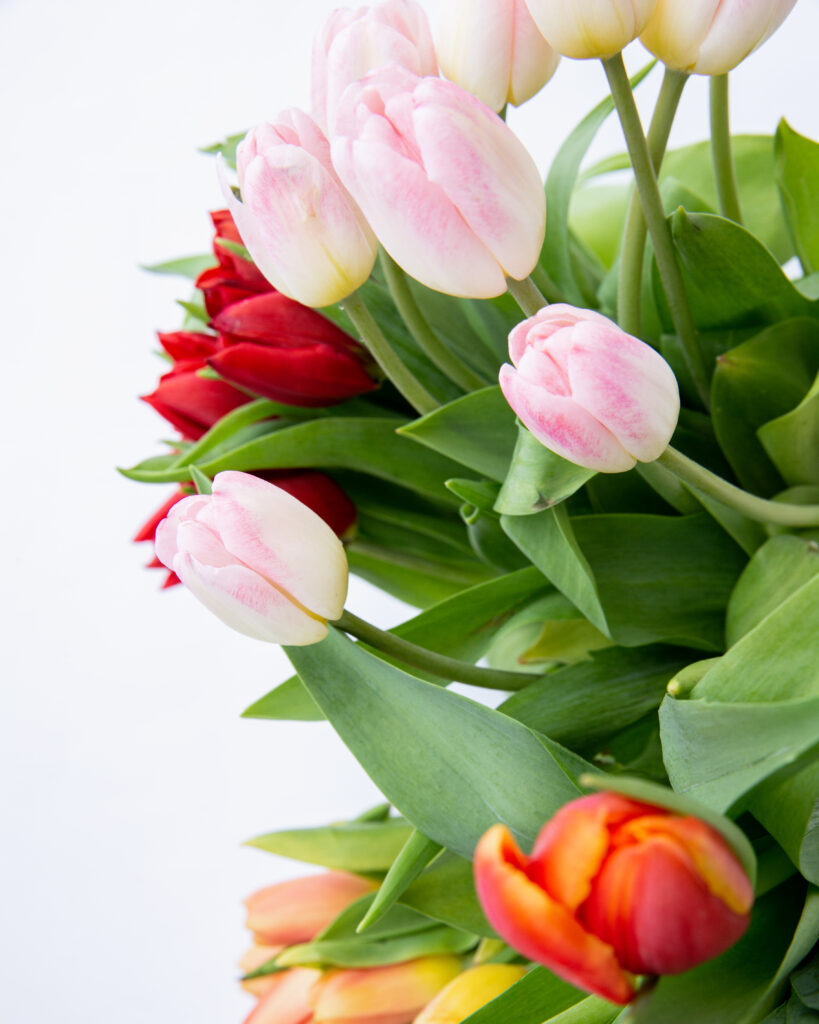
FLOWER CARE There is a whole world of flowers out